Showing posts with label pop art. Show all posts

Friday, February 24, 2017

Arty Farty Friday ~ Richard Hamilton, Father of Pop Art.

 Heaventree of Stars
Some seven years ago, searching for artwork related to astrology I came across this print by English pop artist Richard Hamilton. Its title is from a quotation from James Joyce's Ulysses:
“The heaventree of stars hung with humid nightblue fruit.”

Richard Hamilton was dubbed "Father of Pop Art". It was he who coined a name for the genre in fact; he influenced many artists who came after. Mr Hamilton died, aged 89, in 2011. Today, 24 February is the anniversary of his birth in 1922, it seems appropriate to add to an old post of mine and re-air it.

Hamilton's best known work is a 1956 collage often cited as the beginning of English Pop Art: Just What Is It That Makes Today's Homes So Different, So Appealing? It was originally intended to be a poster advertising a famous London exhibition, This Is Tomorrow.

'Just What Is It That Makes Today’s Homes So Different, So Appealing?'


From a piece by Fiona MacCarthy in The Guardian in 2014:
SNIPS
In Britain in that early postwar era there was a sudden thrilling influx of sophisticated, streamlined consumer goods from the US. It was bonanza time for British housewares, too, as the government-supported Council of Industrial Design (now the Design Council) campaigned to improve standards in British manufacturing and a new breed of industrial designers emerged from British art schools. In 1956, exactly coinciding with Hamilton's collage, the Design Centre opened in the Haymarket, a heaven for aspirational homemakers. There was even a royal seal of approval when Prince Philip's inaugural prize for elegant design was awarded to the Prestcold Packaway refrigerator.

But, as Hamilton was well aware, a backlash was beginning. Richard Hoggart, in The Uses of Literacy (1957), voiced the misgivings of many in lamenting the pervasive influence of American mass culture, "full of corrupt brightness, of improper appeals and moral evasions". There was a dawning consciousness that have-it-all housewives could be less than happy. The Feminine Mystique, Betty Friedan's bestselling analysis of female domestic frustration, would be published in America in 1963. Labour-saving appliances were certainly seductive, but there was now a movement of suspicion and distrust that one might define as Tupperware resistance. As an artist, Hamilton thrived on this ambivalence.

That Hamilton was anti-capitalist is an understatement. But he still adored the uninhibited plenty of American culture. Like other contemporary artists, Allen Jones being an obvious example, he devoured and then recycled the imagery of popular American magazines. He spoke of this as "plundering the popular arts". By popular arts, Hamilton emphatically did not mean the folk arts, which turned him very squeamish. The neo‑romantics, the Kitchen Sink School and the St Ives artists were similar betes noires...........Hamilton's art contained the shock of the eclectic. His all-embracing attitudes caused widespread puzzlement. He challenged the traditional hierarchy of values, the purist view held by the British art establishment of what was proper subject matter for a work of art. Hamilton was a knowledgeable, deeply serious artist who loved and respected the great artists of the past. But he was also determinedly responsive to the modern. The critic David Sylvester, a friend of Hamilton's, described this as verging on madness, a consuming obsession with "modern living, modern technology, modern equipment, modern communications, modern materials, modern processes, modern attitudes"....

Hamilton took pride in variety. His work ranges from book illustration, for instance his 50-year stint illustrating James Joyce's Ulysses, through collages, sculptures, politically charged pictures, digital images, and straight-ahead painting. He was a friend of Paul McCartney and designed the now famous cover of the Beatles' White Album along with the poster which accompanies it. The album cover, one might think, needed little in the way of design, but the story goes that it was made deliberately simple after the uproar following a previous album cover showing the lads with butchered body parts and dolls' heads.


ASTROLOGY

Richard Hamilton was born in London, UK, on 24 February 1922. No birth time available so a 12 noon chart is shown below.


Sun conjunct Venus and Uranus in Pisces; Moon (whatever the birth time)was in Aquarius with Mercury. It's all there, in a nutshell! Sun (self) Venus (art) Uranus(the unexpected, avant garde, eccentric) all closely linked in Pisces (imagination and dreams.) Moon (inner self) and Mercury (communication, mental process) in Aquarius, sign ruled by Uranus (as above).

As if all that weren't enough to describe him, there's a Yod (Finger of Fate) linking Saturn (work, business) and Neptune (creativity) via sextile, then connecting both planets via quincunx (150 degrees) to Uranus and Venus. This formation can be interpreted in astrology as a funnelling of the sextiled planets' blended characteristics through the planet(s) at the apex. So here, creativity (Neptune) and business (Saturn) are blended, and channelled into the world via art (Venus) in a changeable and often unconventional style (Uranus).


EXAMPLES:

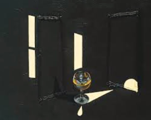
Barmaids Miss Douce and Miss Kennedy from the "Sirens" episode of Ulysses.


The Transmogrification of Bloom (Ulysses)


Shock & Awe (Y'll know this one!)


English politician of the mid 20th century Hugh Gaitskell, disguised as Phantom of the Opera . Hamilton was furious about his refusal to get rid of Britain's nuclear deterrent.


Guggenheim in Chrome


Mick Jagger, and the art dealer Robert Fraser, in handcuffs following a drug raid ( from the Swingeing London series, 1967 - 1972)


BATHROOM


Five Tyres Remoulded


The White Album + Insert


The Artist

Friday, January 30, 2015

Arty Farty Friday ~ Bill Peet & Patrick Caulfield, born 29 January

Two artists with very different styles were born on 29 January: In 1915, American Bill Peet, famous for his work and tempestuous times with Walt Disney, also for his many illustrated children's story books. Born some 21 years later, in the UK, Patrick Caulfield, whose rather different version of 1960s pop-art won him fame.

Briefly:

Bill Peet (January 29, 1915, Grandview Indiana – May 11, 2002), children's book illustrator, and story writer for Disney Studios, 1937-1964. His artistic talent showed up early; he filled the margins of his school books with sketches, later shone as an art student on scholarship at the Herron Art Institute, Indianapolis. Studies completed, he left the midwest for Hollywood, to seek better job opportunities. He was hired as an “in-betweener” to fill in the interstitial cells between the main scenes, for Walt Disney studio’s production of Snow White and the Seven Dwarves, later, with his talent recognised, he climbed the Disney hierachy and worked on films such as Pinocchio, Fantasia, Dumbo , Song of the South, Cinderella, Alice in Wonderland, Peter Pan, Sleeping Beauty, One Hundred and One Dalmatians, The Sword in the Stone, The Jungle Book, and others. He eventually left the Disney Studios after 27 years, following a particularly bitter argument with Walt Disney (one of many throughout his time there) over the story production of The Jungle Book (See this at Blabbing on Arts and Culture blog). He then focused on writing and illustrating books for children, and now has a long list of much-loved children's books to his credit.

An imaginative and stylish storyteller, he would frequently embed messages within his tales. There's an especially good story which I suspect we might all benefit from reading: The Wump World.

Bill Peet married his schooldays sweetheart, Margaret. There's a sweet website created by the Peets' son HERE.


If a passing reader has around 12 minutes to spare, there's a YouTube reading of The Wump World with all his illustrations.


 From his Dumbo story board

More of Bill Peet's Dumbo sketches at Deja View blog HERE.


 From the 1001 Dalmations story board


 From his book The Whingdingdilly


Over the Atlantic and on a different wavelength altogether was Patrick Caulfied, born in Acton, London on 29 January 1936. He died in 2005. A student at the Royal College of Art, 1960-63 along with David Hockney, he developed a unique style characterised by the use of line and depiction of banal, everyday objects saturated in colour and made strangely important. Few human or animal figures grace his artwork, its focus is interiors: office, restaurant, city, decor - all stylised with clean, simple, minimalist flavour. Reviewers of his artwork have pointed out that, though his paintings appeared simple, this was deceptive and rarely the desired effect. By his own admission there were periods when he sought simplicity and others when he sought complexity. The paintings' unity lay in the power of Caulfield's imagination and wry detachment. Resistance to classification meant that Caulfield's work was not as widely known as that of some of his contemporaries.

He is said to have been
"a keen drinker, arriving at his "morning pub" at opening time for Old Speckled Hen, before moving on to double Irish whiskeys. After lunch and work, he went to the evening pub, before returning home to watch television. Glasses of red wine were a frequent motif in his paintings."

"Caulfield was apt to grin sheepishly when making wolfish remarks, especially when declaring his dislike of facile or excessively worthy sorts of painting. He had no time for raw green countryside. Plein air as an excuse for landscape genres enraged him. Interiors for him: places with light switches and engaging artificiality and plentiful refreshments."

Patrick Caulfield married Pauline Jacobs, they had met at Chelsea Art School in 1968; they had three sons. After the marriage was dissolved, in 1999 he married artist Janet Nathan.
(See obituaries at The Telegraph and The Guardian).

After Lunch (1975)
From Tate website HERE
Caulfield's paintings explore alternative ways of picturing the world. After Lunch was one of his earliest works to combine different styles of representation. In this case, what appears to be a photomural of the Château de Chillon hanging in a restaurant is depicted with high-focus realism, contrasting with the cartoon-like black-outlined imagery and fields of saturated colour of its surroundings. Caulfield deliberately makes the relationship between these varying representational methods uneasy and ambiguous, so that the picture appears more real than the everyday world around it.


 Lamp and Pines (1975)


 Tandoori Restaurant


 Second Glass of Whisky (1992)


Entrance (1975)
See Platform 505 HERE
Pictures such as “Entrance” employ a rigorous use of black, with complex arrangements of grids, outlines and trellises. The atmosphere is playful and upbeat yet equivocal. These strange gardens and interiors are recognisable but unfamiliar, a parody of the real thing.
BBC website has a slideshow of some of Caulfield's paintings, HERE.


ASTROLOGY

Bill Peet, born January 29, 1915, Grandview, Indiana. Chart set for 12 noon as no time of birth available.


Patrick Caulfield, born January 29 1936, Acton, London, UK. Chart set for 12 noon as no time of birth available.


The artwork of Bill Peet and Patrick Caultfield was so different in "feel"; will their natal charts reflect this?

I see Peet as being a warmer, softer, more engaged in humanity kind of guy - from his choice of art style and genre. He had the heavier Aquarius input: Sun conjunct modern ruler Uranus, and Mercury conjunct Jupiter all in sign of the Water Bearer. Without a time of birth we can't know where Aquarius was placed house-wise though.

I suspect the warmer, softer feel of Peet's artwork comes via Venus (planet of the arts) in philosophical Sagittarius and a likely Cancer Moon, which could well have been conjunct Neptune(creativity and imagination). Mr Peet's talent for writing stories (for children) to match his artwork is reflected by Mercury (the writer's planet) in helpful sextile to artistic Venus; also significant: Saturn in Mercury-ruled Gemini in harmonious trine to Mercury in Aquarius.


Patrick Caulfield's paintings, though attractive and colourful, have a distinctly distant "feel" to them - detached from the human world, they concentrate on line, precision, design and colour rather than on flesh and blood. Whimsicality is absent, its place taken by what art reviewers see as wry detachment and some embedded humour.

Mr Caulfield was of a different generation from Mr Peet's, born a world away too. He was strongly influenced by art trends of the 1960s. His natal chart spreads rather thinner than Peet's, bringing in, Aquarius Sun and Mercury, with personal planets lying between Aries Moon (whatever his time of birth) to Jupiter in Sagittarius.

Arts planet Venus, in his case, was in Capricorn; this reflects the structural feel, reliant on line, of much of his artwork. Very significantly, too, a close trine between Venus (art) and Uranus (the avant garde) in Venus-ruled Taurus links to his pull towards modernity and an avant garde art style.

Hard-edged Saturn and Mars in Pisces possibly overwhelmed the usual gentle softness of Pisces - as far as his art style was concerned anyway. Jupiter in Sagittarius could be seen as source of the wry humour said to be involved in some of his paintings.

It's a pity no times of birth are known for the two artists - I'd be very surprised if their rising signs didn't contrast quite starkly.

Friday, October 03, 2014

Arty Farty Friday ~ James Rizzi

James Rizzi. He was born on 5 October 1950, in Brooklyn, New York, into a family of Irish-Italian background. He died aged 61 in December 2011. I hadn't, knowingly, come across his work before. Its focus is on urban life - New York in particular, a city which he obviously loved a lot. His paintings are usually categorised as "pop art", but are quite different from the work of Warhol, Lichenstein, Hockney; more comparable with Keith Haring 's or Wayne Thiebaud's. (Links are to archived posts of mine.)

Rizzi's paintings are full to the brim, it's hard to ever find a smidgin of blank space. They have a naive, childlike feel: happy, uninhibited, enthusiastic, and....well, not a little zany! His work has been described by critic Glenn O'Brien as a cross between Picasso and Hanna-Barbera, combined with an evocation of Native American friezes.

Rizzi's friend, Matthew Posnick told the New York Daily News that:
“Jimmy always retained the ability to see the world through the eyes of a child, with innocence and fun and a humorous, childlike wonder for everything that happened in this world.”
From obituaries (linked below) he was said to have been
"an ebullient figure, highly sociable and a lover of basketball and golf, who frequently worked for children's and Aids charities."
New York was obviously his first, and abiding love, but German cities seemed to "get" him too, so much so that it was from that country he obtained many commissions. Teddy bears, a boxer's robe, German postage stamps, the dome of a shopping mall in Oberhausen, and the Happy Rizzi House, a psychedelic office block, in Braunschweig. In 1999 he adorned the bodywork of three cars promoting the Volkswagen Beetle.

From his start in the early 1970s, when police would shut him down as he tried to sell his work on the sidewalks of Brooklyn Heights or in Washington Square Park, Rizzi rose to huge international appreciation spanning continents.


More detail at: Wikipedia, The Guardian, New York Daily News.

Examples of his work. Please click on the images for clearer or enlarged views.


ASTROLOGY

The chart is set for 12 noon, as I have found no information on his time of birth.


We can't be sure of Moon's exact position. In late Cancer at 12 noon it could have been in Cancer or early Leo as Rizzi was born. It'd be fitting if he had been born somewhere around noon or early afternoon, because then a Yod would have formed linking Venus (the arts)/Saturn (work)/Mercury(communication) to Moon (inner self) by sextile, and those planets to Jupiter in Aquarius by quincunx. I like to think of a Yod as calming otherwise scratchy aspects and making them work. In this case Jupiter in Aquarius at the apex of the Yod describes Rizzi's art exactly: a lot (Jupiter) of life's oddities (Aquarius). Jupiter in Aquarius, in any case, is acting as a kind of funnel for the loose bundle of planets occupying the other half of the chart.
That's his art signature : Jupiter in Aquarius!

Friday, June 15, 2012

Arty Farty Hearty Friday ~ Jim Dine, His and Our Hearts

Jim Dine, one of the original painters of Pop Art in the 1960s, has a birthday tomorrow. He was born in Cincinnati, Ohio on 16 June 1935.
Over more than four decades according to THIS website:
Dine has produced more than three thousand paintings, sculptures, drawings, and prints, as well as performance works, stage and book designs, poetry, and even music. His art has been the subject of numerous individual and group shows and is in the permanent collections of museums around the world. Renowned for his wit and creativity as a Pop and Happenings artist, he has a restless, searching intellect that leads him to challenge himself constantly. (Very Gemini!) .........Objects, most importantly household tools, began to appear in his work at about the same time; a hands-on quality distinguished these pieces, which combine elements of painting, sculpture, and installation, as well as works in various other media, including etching and lithography. Through a restricted range of obsessive images, which continue to be reinvented in various guises - bathrobe, heart, outstretched hand, wrought-iron gate, and Venus de Milo - Dine presents compelling stand-ins for himself and mysterious metaphors for his art.
It's the obsession with hearts on which I'm concentrating here, rather than the rest of Mr Dine's work. Examples of his other subjects can be seen via a Google Image search.

Why hearts? Because I am married to a guy who displays a similar obsession - no, that's a bit hyperbolic. My husband likes heart symbols and has collected small sculptures of them for years. During our first few years together he used to hide little hearts all over the place for me to find.....until, after filling various receptacles with them, I respectfully and lovingly but whole-heartedly asked him to desist. There are still one or two tiny hearts hidden on tops of door frames and in the recesses of purses. We also have one or two larger heart sculptures, collected at arts fairs or in antique/junk stores.

But - back to Jim Dine's natal chart. A quick gander at this, then at a few of his hearts, then a look at one or two of ours.


In looking at the charts of artists specialising in Pop Art my first thought used to be to look for Uranus and/or Aquarius. I realised that this isn't necessarily correct when looking at charts of Andy Warhol, and Roy Lichenstein in a post HERE. Aquarius is a mentally oriented sign given to analysis, often interested in politics of one stripe or another. The fact that Pop Art burst onto the scene in the 1960s along with the Beatles, Hair, etc. etc. certainly smacks of Uranus though.

Jim Dine is younger than Warhol and Lichenstein, his style is certainly much softer than Warhol's whose chart is very Fiery. Lichenstein's is more Watery, and akin to Dine's - but still has not many similarities.

Saturn may have more connection to Pop Art than is obvious on first thought. Subject matter tended to be everyday objects, things, solids.....Saturn?

For Dine's astro art signature I'll go for the Yod (Finger of Fate) linking sextiled Venus(Art) and Mars(energy) with Saturn via two quincunx (150*) aspects. Saturn at the apex is the "channel" for his artistic temperament.

Dine's Airy, fairly late Gemini Sun is conjunct Mercury in ultra-sensitive Cancer - possibly his draw to draw hearts?

To be honest, I don't see the amount of avant garde in this chart I'd have expected. Dine was thought "a bit of a rebel". I don't see that in the chart. His Sagittarius Moon could incline him to "overdo" things - go too far at times, maybe that's the key.

A few examples of Dine's hearty art:


A SCANT FEW FROM OUR OWN HEART COLLECTION, there are lots more!